

07-瀑布流布局
https://www.w3cschool.cn/article/48614293.html
https://blog.csdn.net/Jzsn_Paul/article/details/140169578
https://juejin.cn/post/7368855076130488339
https://developers.weixin.qq.com/community/develop/article/doc/00004a4ae7c7a8aaddca7dc4f56413
这个瀑布流布局真的坑很多很多,还是挺难的,网上绝大部分都有瑕疵,都不能用。
- 支持下一页加载
- 高度由里面的子元素(一般为图片)高撑开
- 需要考虑图片加载慢的问题
绝对定位实现
完美实现!!!
html
<!doctype html>
<html lang="en">
<head>
    <meta charset="UTF-8">
    <meta name="viewport"
          content="width=device-width, user-scalable=no, initial-scale=1.0, maximum-scale=1.0, minimum-scale=1.0">
    <meta http-equiv="X-UA-Compatible" content="ie=edge">
    <title>Document</title>
    <style>
        *{margin: 0;padding: 0;}
        .main{
            border: 1px solid #c1c1c1;
            width: 900px;
            height: 100vh;
            position: relative;
            margin: 0 auto;
        }
        .item{
            width: 150px;
            float: left;
        }
        .auxiliary{ /* 很重要,用来设置子item的margin,曲线救国 */
            background: #4CAF50;
            margin: 5px;
        }
        .item-img {

        }
        img {  /* 一定要加这个,不然item-img的高会比img的高多几个像素 */
            display: block; /* 改为块级元素 */
            vertical-align: top; /* 如果仍然希望保留行内特性 */
        }
    </style>

    <script>
        function getData(curSize){
            let list = []
            for (let i = 0; i < curSize; i++) {
                list.push(`https://picsum.photos/200/${num(100, 300)}?v=` + Math.random())
            }
            return list;
        }
        let num = (min,max) => {
            return Math.floor(Math.random() * max) + min
        }
        function parseHTML(htmlString) {
            const parser = new DOMParser();
            const doc = parser.parseFromString(htmlString, 'text/html');
            return doc.body.firstChild; // 返回第一个子元素
        }
        function insertImgToPage(src){
            let app = document.getElementById("app");
            let htmlString = `<div class="item"><div class="auxiliary"><div class="item-img"><img style="width: 100%"  src="${src}" alt=""></div></div></div>`
            const domElement = parseHTML(htmlString);
            app.appendChild(domElement);
            return domElement;
        }
        let item_ok_list = [] //已经完成瀑布流布局的图片
        let g_width = 150 //全局宽度
        let column; //几列
        function preDeal(parent){
            let cParent =document.getElementById(parent);
            let p_width =cParent.offsetWidth;
            column =Math.floor(p_width/g_width);
        }
        window.onload = function (){
            preDeal('app')
        }

        function add(){
            // 1、获取数据
            let list = getData(10);
            // 2、获取图片url集合
            let images = list;
            // 3、判断那些图片加载OK,放到数组
            let completeImgList = [] //加载好的图片
            // 开始加载图片
            images.forEach(src => {
                const img = new Image();
                // 监听图片加载完成事件
                img.onload = function() {
                    console.log(src + ' loaded');
                    completeImgList.push(src);

                    // 4、将加载好的图片插入到页面
                    let item = insertImgToPage(src);

                    // 5、瀑布流布局
                    pubu('app',item)
                };
                img.onerror = function() {
                    console.error(src + ' failed to load');
                };
                img.src = src; // 开始加载图片
            });
        }
        let boxHeightArr =[];
        function pubu(parent,child){
            if (item_ok_list.length < column){
                boxHeightArr.push(child.offsetHeight);
            }else{
                let minHeight =Math.min(...boxHeightArr);
                let minIndex =boxHeightArr.indexOf(minHeight);
                child.style.position ='absolute';
                child.style.top =`${minHeight}px`;
                child.style.left =`${g_width * minIndex}px`;
                boxHeightArr[minIndex]+=child.offsetHeight;
            }
            item_ok_list.push(child)
        }
    </script>
</head>
<body>
<button onclick="add()"> add </button>
<div id="app" class="main">

</div>
</body>
</html>Vue3的写法
vue
<template>
  <div>
    <button @click="addImages">Add Images</button>
    <div id="myPicture" class="main" ref="appRef"></div>
  </div>
</template>

<script setup>
import { onMounted, ref, nextTick } from 'vue';

const appRef = ref(null);

//加载OK的全部照片集合
const item_ok_list = ref([]);
//当前查看的图片
const currentPic = ref('');
// 每列的高集合
const boxHeightArr = ref([]);
//容器ID
const parentId = "myPicture"
//固定宽
const g_width = 150;
//几列
let column;


function getData(curSize) {
  let list = [];
  for (let i = 0; i < curSize; i++) {
    list.push(`https://picsum.photos/200/${num(100, 300)}?v=` + Math.random())
  }
  return list;
}
let num = (min,max) => {
  return Math.floor(Math.random() * max) + min
}

function insertImgToPage(src) {
  const htmlString = `
    <div class="item">
      <div class="auxiliary">
        <div class="item-img">
          <img style="width: 100%;" src="${src}" alt="" />
        </div>
      </div>
    </div>
  `;
  const domElement = parseHTML(htmlString);
  appRef.value.appendChild(domElement);
  return domElement;
}

function parseHTML(htmlString) {
  const parser = new DOMParser();
  const doc = parser.parseFromString(htmlString, 'text/html');
  return doc.body.firstChild;
}


function preDeal() {
  const cParent = document.getElementById(parentId);
  const p_width = cParent.offsetWidth;
  column = Math.floor(p_width / g_width);
}
onMounted(() => {
  preDeal()
});


function addImages() {
  const list = getData(10);

  list.forEach((src) => {
    const img = new Image();

    img.onload = () => {
      console.log(`${src} loaded`);

      const item = insertImgToPage(src);
      pubu(item);

      // 获取实际插入到 DOM 中的 img 元素,并绑定点击事件
      const imgElement = item.querySelector('img');
      bindClickEvent(imgElement);
    };

    img.onerror = () => {
      console.error(`${src} failed to load`);
    };

    img.src = src;
  });

}
function bindClickEvent(img) {
  // 绑定 click 事件
  img.addEventListener('click', function(event) {
     currentPic.value = event.target.src
  });
}

function pubu(child) {
  if (item_ok_list.value.length < column) {
    boxHeightArr.value.push(child.offsetHeight);
  } else {
    const minHeight = Math.min(...boxHeightArr.value);
    const minIndex = boxHeightArr.value.indexOf(minHeight);
    child.style.position = 'absolute';
    child.style.top = `${minHeight}px`;
    child.style.left = `${g_width * minIndex}px`;
    boxHeightArr.value[minIndex] += child.offsetHeight;
  }
  item_ok_list.value.push(child);
}
</script>

<style>
#myPicture {
  /*border: 1px solid #c1c1c1;*/
  /* background: #4CAF50;*/
  width: 900px;
  min-height: 600px;
  position: relative;
  margin: 0 auto;

  /*overflow: auto;*/
}
#myPicture .item {
  width: 150px;
  float: left;
}
#myPicture .auxiliary {
  background: #4CAF50;
  margin: 5px;
}
#myPicture .item-img {
  display: block;
  vertical-align: top;
}
#myPicture img {
  display: block;
  vertical-align: top;
}
/**隐藏滚动条*/
#myPicture::-webkit-scrollbar {
  width: 0.5em;
}

#myPicture::-webkit-scrollbar-track {
  background-color: transparent;
}

#myPicture::-webkit-scrollbar-thumb {
  background-color: transparent;
}
</style>css+js实现
实现1
非常完美

html
<!DOCTYPE html>
<html lang="zh-CN">
<head>
    <meta charset="UTF-8">
    <meta name="viewport" content="width=device-width, initial-scale=1.0">
    <title>瀑布流布局</title>
    <style>
        /* 重置样式 */
        * {
            margin: 0;
            padding: 0;
            box-sizing: border-box;
        }

        body {
            font-family: Arial, sans-serif;
            background-color: #f8f8f8;
        }

        /* 瀑布流容器 */
        .waterfall {
            display: flex;
            flex-wrap: wrap;
            padding: 10px;
        }

        /* 每一列的样式 */
        .column {
            flex: 1;
            min-width: 45%; /* 两列布局,留一些间距 */
            margin: 0 5px;
        }

        /* 每个卡片项的样式 */
        .card {
            background-color: #fff;
            border-radius: 8px;
            margin-bottom: 10px;
            overflow: hidden;
            box-shadow: 0 2px 4px rgba(0, 0, 0, 0.1);
        }

        /* 图片容器 */
        .card img {
            width: 100%;
            display: block;
            border-radius: 8px 8px 0 0;
            object-fit: cover;
        }

        /* 骨架屏占位符 */
        .card .skeleton {
            width: 100%;
            height: 200px; /* 假设图片高度为200px */
            border-radius: 8px 8px 0 0;
            background: linear-gradient(90deg, #f0f0f0 25%, #e0e0e0 50%, #f0f0f0 75%);
            background-size: 200% 100%;
            animation: loading 1.5s infinite;
            z-index: 1;
        }

        /* 标题样式 */
        .card .title {
            padding: 10px;
            font-size: 14px;
            color: #333;
        }
        /* 骨架屏动画 */
        @keyframes loading {
            0% {
                background-position: 200% 0;
            }

            100% {
                background-position: -200% 0;
            }
        }
    </style>
</head>
<body>
<div class="waterfall">
    <!-- 第一列 -->
    <div class="column" id="column1"></div>
    <!-- 第二列 -->
    <div class="column" id="column2"></div>
</div>

<script>
    // 模拟数据
    const data = [
        { image: "https://picsum.photos/300/300", title: "标题1" },
        { image: "https://picsum.photos/300/100", title: "标题2" },
        { image: "https://picsum.photos/300/500", title: "标题3" },
        { image: "https://picsum.photos/300/200", title: "标题4" },
        { image: "https://picsum.photos/300/300", title: "标题5" },
        { image: "https://picsum.photos/300/400", title: "标题6" },
        { image: "https://picsum.photos/300/500", title: "标题3" },
        { image: "https://picsum.photos/300/200", title: "标题4" },
        { image: "https://picsum.photos/300/300", title: "标题5" },
        { image: "https://picsum.photos/300/400", title: "标题6" },
    ];

    // 获取列元素
    const column1 = document.getElementById("column1");
    const column2 = document.getElementById("column2");

    // 动态加载卡片
    data.forEach((item, index) => {
        // 创建卡片
        const card = document.createElement("div");
        card.className = "card";

        // 图片部分(骨架屏占位符)
        const imageContainer = document.createElement("div");
        imageContainer.className = "skeleton";
        card.appendChild(imageContainer);

        // 标题部分
        const title = document.createElement("div");
        title.className = "title";
        title.textContent = item.title;
        card.appendChild(title);

        // 动态加载图片
        const img = new Image();
        img.src = item.image;
        img.onload = () => {
            // 图片加载完成后替换骨架屏
            imageContainer.replaceWith(img);
        };

        // 根据索引决定添加到哪一列
        if (index % 2 === 0) {
            column1.appendChild(card);
        } else {
            column2.appendChild(card);
        }
    });
</script>
</body>
</html>实现2
html
<!DOCTYPE html>
<html lang="en">

<head>
    <meta charset="UTF-8">
    <!-- 适配移动端 -->
    <meta name="viewport" content="width=device-width, initial-scale=1.0">
    <title>小红书瀑布流布局</title>
    <style>
        /* 全局样式,去除默认的内外边距 */
        body {
            margin: 0;
            padding: 0;
            font-family: Arial, sans-serif;
            background-color: #f4f4f4;
        }

        /* 瀑布流容器样式 */
        .waterfall-container {
            /* 列数为 2,实现一行两列布局 */
            column-count: 2;
            /* 列之间的间距为 10px */
            column-gap: 10px;
            padding: 10px;
        }

        /* 卡片样式 */
        .card {
            /* 防止卡片跨列显示 */
            break-inside: avoid;
            background-color: #fff;
            border-radius: 8px;
            /* 卡片阴影效果 */
            box-shadow: 0 2px 4px rgba(0, 0, 0, 0.1);
            margin-bottom: 10px;
            overflow: hidden;
            position: relative;
        }

        /* 图片样式 */
        .card img {
            width: 100%;
            height: auto;
            display: block;
        }

        /* 标题样式 */
        .card-title {
            padding: 10px;
            font-size: 14px;
            line-height: 1.4;
        }

        /* 骨架屏样式 */
        .skeleton::before {
            content: "";
            position: absolute;
            top: 0;
            left: 0;
            right: 0;
            bottom: 0;
            background: linear-gradient(90deg, #f0f0f0 25%, #e0e0e0 50%, #f0f0f0 75%);
            background-size: 200% 100%;
            animation: loading 1.5s infinite;
            z-index: 1;
        }

        /* 骨架屏动画 */
        @keyframes loading {
            0% {
                background-position: 200% 0;
            }

            100% {
                background-position: -200% 0;
            }
        }
    </style>
</head>

<body>
<!-- 瀑布流容器 -->
<div class="waterfall-container">
    <!-- 卡片示例 -->
    <div class="card skeleton">
        < img src="https://picsum.photos/800/400" alt="Image 1" onload="this.parentNode.classList.remove('skeleton')">
        <div class="card-title">这是第一张图片的标题</div>
    </div>
    <div class="card skeleton">
        < img src="https://picsum.photos/300/350" alt="Image 2" onload="this.parentNode.classList.remove('skeleton')">
        <div class="card-title">这是第二张图片的标题</div>
    </div>
    <div class="card skeleton">
        < img src="https://picsum.photos/300/450" alt="Image 3" onload="this.parentNode.classList.remove('skeleton')">
        <div class="card-title">这是第三张图片的标题</div>
    </div>
    <div class="card skeleton">
        < img src="https://picsum.photos/300/300" alt="Image 4" onload="this.parentNode.classList.remove('skeleton')">
        <div class="card-title">这是第四张图片的标题</div>
    </div>
    <div class="card skeleton">
        < img src="https://picsum.photos/300/800" alt="Image 4" onload="this.parentNode.classList.remove('skeleton')">
        <div class="card-title">这是第五张图片的标题</div>
    </div>
    <div class="card skeleton">
        < img src="https://picsum.photos/300/200" alt="Image 4" onload="this.parentNode.classList.remove('skeleton')">
        <div class="card-title">这是第六张图片的标题</div>
    </div>
</div>
</body>

</html>grid实现
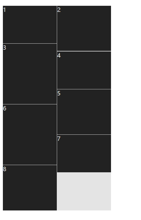
实现一
先看一个小demo,看似看不错,其实有很大的问题,这个高度不是动态的,是写死的。我们想要的是高度是由里面的子元素的高撑开的。
html
<!doctype html>
<html lang="en">
<head>
    <meta charset="UTF-8">
    <meta name="viewport"
          content="width=device-width, user-scalable=no, initial-scale=1.0, maximum-scale=1.0, minimum-scale=1.0">
    <meta http-equiv="X-UA-Compatible" content="ie=edge">
    <title>Document</title>
    <style>
        .main {
            background: #e4e4e4;
            display: grid;
            width: 300px;
            grid-template-columns: repeat(2, 1fr);   /*指定两列,自动宽度*/
            grid-gap: 1px;  /*横向,纵向间隔*/
            grid-auto-flow: row dense;  /*是否自动补齐空白*/
            grid-auto-rows: 20px;  /*base高度,grid-row基于此运算*/
        }
        .main .item {
            width: 100%;
            background: #222;
            color: #ddd;
        }

        .main .item:nth-of-type(3n+1) {
            grid-row: auto / span 5;
        }

        .main .item:nth-of-type(3n+2) {
            grid-row: auto / span 6;
        }

        .main .item:nth-of-type(3n+3) {
            grid-row: auto / span 8;
        }
    </style>

</head>
<body>
<div class="main">
    <div class="item">1</div>
    <div class="item">2</div>
    <div class="item">3</div>
    <div class="item">4</div>
    <div class="item">5</div>
    <div class="item">6</div>
    <div class="item">7</div>
    <div class="item">8</div>
</div>
</body>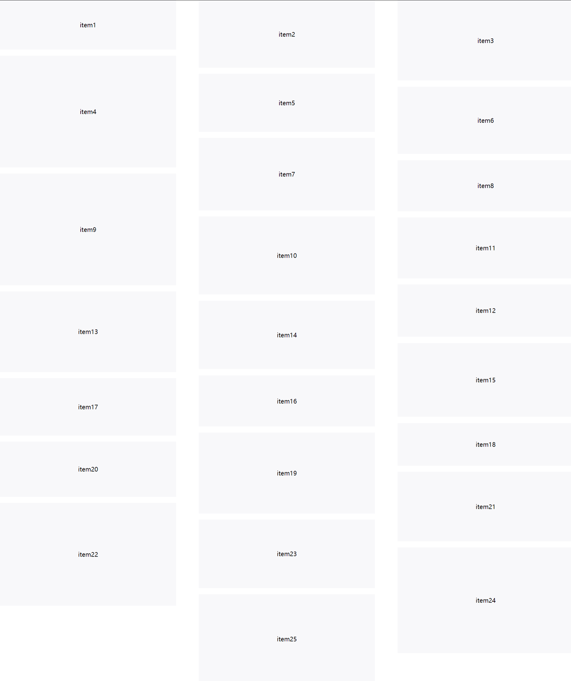
</html>实现二
html
<!DOCTYPE html>
<html lang="zh">
<head>
    <meta charset="UTF-8">
    <meta name="viewport" content="width=device-width, initial-scale=1.0">
    <title>Demo</title>
    <style>
        body {
            margin: 0;
        }
        .masonry {
            display: grid;
            grid-template-columns: repeat(4, 1fr);
            grid-gap: 0 60px;
            grid-auto-rows: 2px;
            align-items: end;
        }
        .item {
            background: #f8f8fa;
            display: flex;
            justify-content: center;
            align-items: center;
        }

        @media (min-width: 1280px) and (max-width: 1920px) {
            .masonry {
                grid-template-columns: repeat(3, 1fr);
            }
        }
        @media (min-width: 768px) and (max-width: 1280px) {
            .masonry {
                grid-template-columns: repeat(2, 1fr);
            }
        }
        @media (max-width: 768px) {
            .masonry {
                grid-template-columns: repeat(1, 1fr);
            }
        }
    </style>
</head>
<body>
<div class="masonry">
    <div class="item">item1</div>
    <div class="item">item2</div>
    <div class="item">item3</div>
    <div class="item">item4</div>
    <div class="item">item5</div>
    <div class="item">item6</div>
    <div class="item">item7</div>
    <div class="item">item8</div>
    <div class="item">item9</div>
    <div class="item">item10</div>
    <div class="item">item11</div>
    <div class="item">item12</div>
    <div class="item">item13</div>
    <div class="item">item14</div>
    <div class="item">item15</div>
    <div class="item">item16</div>
    <div class="item">item17</div>
    <div class="item">item18</div>
    <div class="item">item19</div>
    <div class="item">item20</div>
    <div class="item">item21</div>
    <div class="item">item22</div>
    <div class="item">item23</div>
    <div class="item">item24</div>
    <div class="item">item25</div>
</div>

<script>
    // 给每个元素模拟随机高度
    window.addEventListener('load', () => {
        document.querySelectorAll('.masonry > .item').forEach(item => {
            item.style.height = `${Math.floor(Math.random() * 200) + 100}px`
        })
    })

    const calcRows = () => {
        const masonry = document.querySelector('.masonry')
        const items = masonry.querySelectorAll('.item')
        // 获取当前列数  这个API可以直接使用,grid专门提供的
        const cols = getComputedStyle(masonry).gridTemplateColumns.split(" ").length;
        items.forEach((item, index) => {
            // 给需要上下间隔的元素增加上间隔(每列第一个元素无需上间隔)
            const gapRows = index >= cols ? 8 : 0;
            // 根据元素高度设置元素的需占行数
            const rows = Math.ceil(item.clientHeight / 2) + gapRows;
            item.style.gridRowEnd = `span ${rows}`;
        })
    }
    window.addEventListener('resize', calcRows)
    window.addEventListener('load', calcRows)
</script>
</body>
</html>实现无限滚动
主要是利用了IntersectionObserver这个API的能力,检测目标dom是否出现在容器的视口中
描述: 定义了在目标元素与根相交时,触发回调的可见性阈值,范围在 0 到 1 之间。
threshold:
- 0 表示只要有任何部分可见,回调就会触发;
- 1 表示目标元素全部可见时才会触发。
html
<!DOCTYPE html>
<html lang="en">
<head>
    <meta charset="UTF-8">
    <meta name="viewport" content="width=device-width, initial-scale=1.0">
    <title>Intersection Observer Demo</title>
    <style>
        #container {
            height: 200px;
            overflow: auto;
            border: 1px solid #000;
        }
        #target {
            height: 100px;
            background-color: lightblue;
            margin-top: 300px; /* initial position is outside of the viewport */
        }
        .spacer {
            height: 500px; /* create space to scroll */
        }
    </style>
</head>
<body>
    <div id="container">
        <div class="spacer"></div>
        <div id="target">Target Element</div>
    </div>

    <script>
        const target = document.getElementById('target');
        const container = document.getElementById('container');

        const options = {
            root: container, // 观察的上下文元素
            rootMargin: '0px',
            threshold: 0.1 // 目标元素在根元素中可见的百分比时触发
        };

        const callback = (entries, observer) => {
            entries.forEach(entry => {
                if (entry.isIntersecting) {
                    // 元素出现在容器内,触发事件
                    console.log('Target is inside the container!');
                    // 这里可以执行更多的逻辑,比如调用其他函数等

                    // 如果你只希望触发一次事件,可以取消观察
                    observer.unobserve(entry.target);
                }
            });
        };

        const observer = new IntersectionObserver(callback, options);
        observer.observe(target); // 开始观察目标元素
    </script>
</body>
</html>